

Final Graphic design post


Graphic Design Project

Links
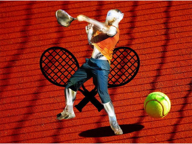
https://pixabay.com/vectors/rackets-racquets-tennis-crossed-296813/
https://www.freeimages.com/photo/light-painting-1-1165130
https://www.pexels.com/photo/yellow-sport-ball-tennis-66323/
Citations
(n.d.). Green Tennis Ball on Red Floor during Sunny Day · Free Stock Photo. Retrieved from https://www.pexels.com/photo/yellow-sport-ball-tennis-66323/
(n.d.). Light Painting 1. Retrieved from https://www.freeimages.com/photo/light-painting-1-1165130
Free Image on Pixabay – Rackets, Racquets, Tennis, Crossed. (n.d.). Retrieved from https://pixabay.com/vectors/rackets-racquets-tennis-crossed-296813/
Image Collection

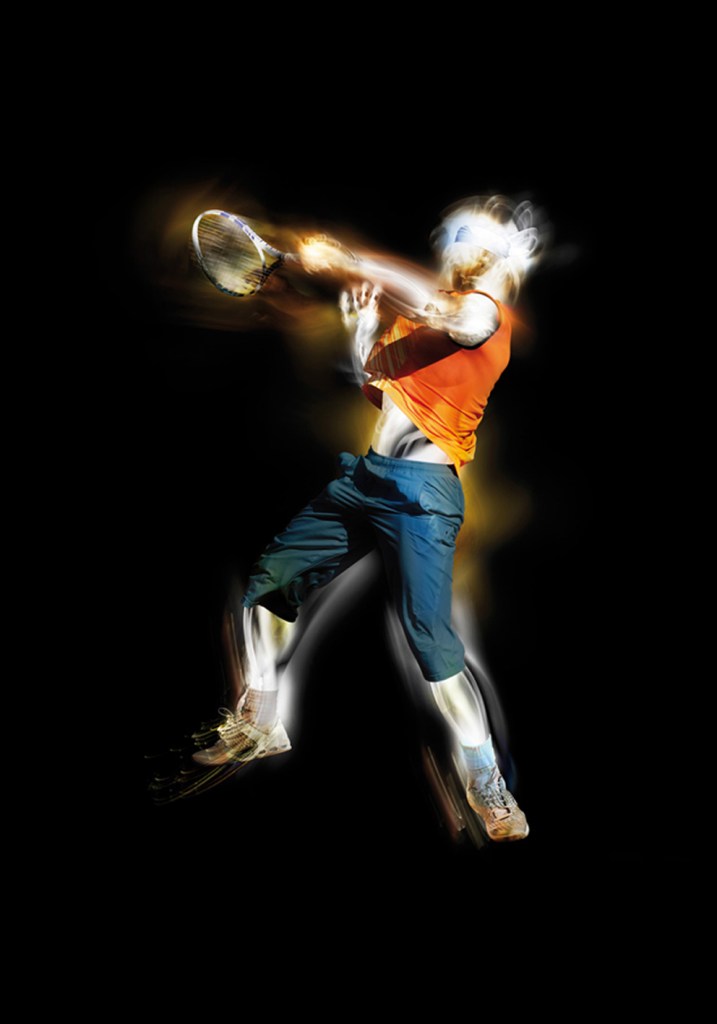
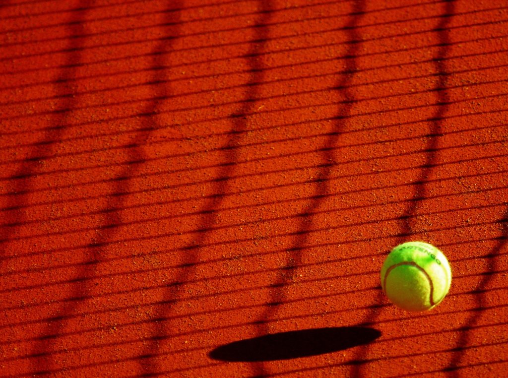
These pictures are a representation of the components of tennis. They show the action and the equipment used in the game. These images to a tennis player immediately light up in a tennis players head and I want these to do the same for those who see my project.
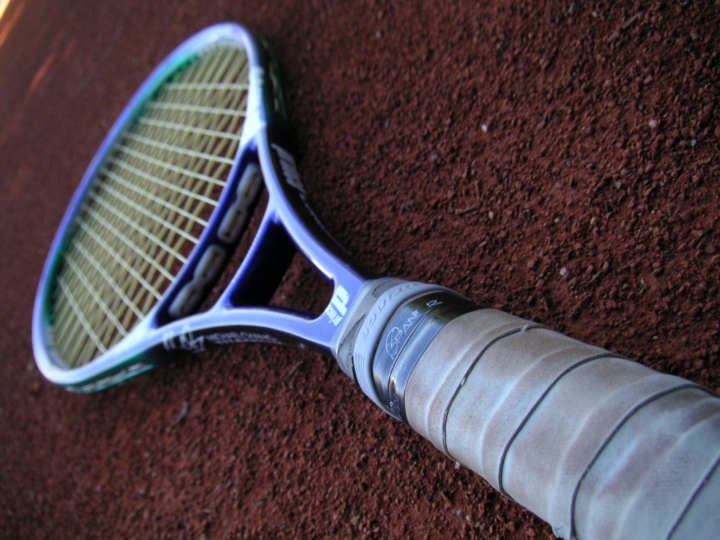
(n.d.). Tennis Racket 2. Retrieved from https://www.freeimages.com/photo/tennis-racket-2-1492104
(n.d.). Light Painting 1. Retrieved from https://www.freeimages.com/photo/light-painting-1-1165130
(n.d.). Green Tennis Ball on Red Floor during Sunny Day · Free Stock Photo. Retrieved from https://www.pexels.com/photo/yellow-sport-ball-tennis-66323/


Topic Choice
The topic I have chosen this semester is the club tennis here at WSU. I decided on this because I love playing the sport and have been playing for almost 9 years. There is a good size community with club tennis and I am excited to join and be apart of it. The other reason that i decided on this was because i think it will be fairly easy to collect information for this assignment. The club meets twice a week for a 3 hour period and I feel that is a good amount of time to collect photos, audio, and much more. I am excited to create a logo for this too. I did an assignment last year for my COM 102 class where we created logos and I feel I will have the same fun with this one. Also the audio portion could be fun. Getting to interview fellow members or capturing the sounds of the game could be very useful to this project. There are a couple of sources that i found that tie in well with my topic. I found a website called “Essential Tennis” and it is a site full if useful tennis tips. It is a podcast website that dives into different styles and techniques to improve a players performance. Another fun media source that I found was the Youtube channel for the company Tennis Warehouse. The company sells many different tennis products and on their channel they do product reviews with a demonstration videos of racquet performance and talks about which racquets pros use. Finally, I follow a page on Instagram called @Tennis. They post great pictures of pros performing or celebration on the court. All of these inspire me to play the best that I can and I am excited to do this project on the club tennis here at Washington State.
My First Blog Post
Be yourself; Everyone else is already taken.
— Oscar Wilde.
This is the first post on my new blog. I’m just getting this new blog going, so stay tuned for more. Subscribe below to get notified when I post new updates.
Introduce Yourself (Example Post)
This is an example post, originally published as part of Blogging University. Enroll in one of our ten programs, and start your blog right.
You’re going to publish a post today. Don’t worry about how your blog looks. Don’t worry if you haven’t given it a name yet, or you’re feeling overwhelmed. Just click the “New Post” button, and tell us why you’re here.
Why do this?
- Because it gives new readers context. What are you about? Why should they read your blog?
- Because it will help you focus you own ideas about your blog and what you’d like to do with it.
The post can be short or long, a personal intro to your life or a bloggy mission statement, a manifesto for the future or a simple outline of your the types of things you hope to publish.
To help you get started, here are a few questions:
- Why are you blogging publicly, rather than keeping a personal journal?
- What topics do you think you’ll write about?
- Who would you love to connect with via your blog?
- If you blog successfully throughout the next year, what would you hope to have accomplished?
You’re not locked into any of this; one of the wonderful things about blogs is how they constantly evolve as we learn, grow, and interact with one another — but it’s good to know where and why you started, and articulating your goals may just give you a few other post ideas.
Can’t think how to get started? Just write the first thing that pops into your head. Anne Lamott, author of a book on writing we love, says that you need to give yourself permission to write a “crappy first draft”. Anne makes a great point — just start writing, and worry about editing it later.
When you’re ready to publish, give your post three to five tags that describe your blog’s focus — writing, photography, fiction, parenting, food, cars, movies, sports, whatever. These tags will help others who care about your topics find you in the Reader. Make sure one of the tags is “zerotohero,” so other new bloggers can find you, too.
